An interesting comparison
September 10, 2011
A friend sent me an article in the New York Times, in which the author uses the data from his GPS bike computer to fill in the gaps in his memory following a crash. The Times’ illustrator Johnathan Corum created an infographic depicting the rider’s route, and the data from the bike computer. It’s a nice figure, but it’s gratuitously similar to the classic Minard depiction of Napoleon’s 1918 march to Moscow (often cited as one of the best infographics ever, and available as a poster from Edward Tufte.)
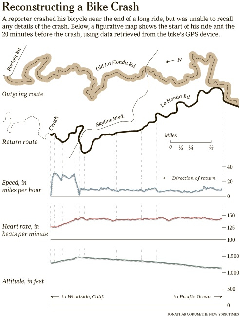
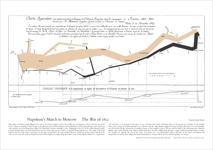
While I like Corum’s inforgraphic, it doesn’t really hold a candle to Minard’s in terms of how the information is conveyed. Minard has layered the size of Napoleon’s army over its route into, and retreat from, Russia; and correlated their position (and thus diminishing strength) with the temperature. Corum’s figure, however, manages only the latter technique, and while it captures the aesthetic of Minard’s canonical work, it lacks the compelling ingenuity of synthesis.